
TL;DR

Get business pricing on tools and workshop supplies
- Business-only prices and quantity discounts
- Tax-exempt purchasing
- Multiple users, one account, clear invoices
Livingetc’s Style Pulse report for spring/summer 2027 identifies mint green as an emerging interior color, following its appearances in recent fashion collections and at Milan Design Week. Designers quoted in the report describe it as fresh and energetic, while suggesting it be used in controlled doses and balanced with earth tones or warmer colors.
Livingetc’s Style Pulse report for spring/summer 2027 identifies mint green as an emerging color for interiors, with designers describing the light, blue-leaning shade as a fresh alternative to recent olive and sage palettes. The report points to its growing presence in fashion and design events, but it is a trend forecast rather than evidence that mint is already widespread across homes.
The report calls mint an “oxygenated green”, a pastel shade that sits between associations with nature and a more synthetic, digital look. Color expert Amy Moorea Wong, quoted by Livingetc, links its futuristic quality to mid-century space-age design as well as contemporary screens and app culture. She says the color can bring a noticeable burst of energy without the intensity of fluorescent green.
Livingetc editor Hugh Metcalf said he had seen the shade repeatedly at Milan Design Week, describing it as disruptive enough to animate a scheme but softer than more acidic greens. The report also tracks mint on recent runways: in Fendi’s Spring/Summer 2026 collection, Matthieu Blazy’s first Chanel collection, and Loewe’s 2027 spring ready-to-wear show. Those appearances offer cultural context for the forecast, but do not establish how widely the color is being adopted in residential design.
Interior designers interviewed for the report describe different ways to use it. Samantha Hauvette of Paris studio Hauvette & Madani says mint can work as a deliberate accent, including alongside turquoise. Chicago designer Jennifer Sucher says she balances saturated color with earth tones or deeper muted shades; in one room, she paired a mint wall with burgundy art. Color consultant Harriet Slaughter associates the shade with 1930s-to-1950s interiors and says it can suit bright rooms such as kitchens and bathrooms.
How Designers Are Using Mint
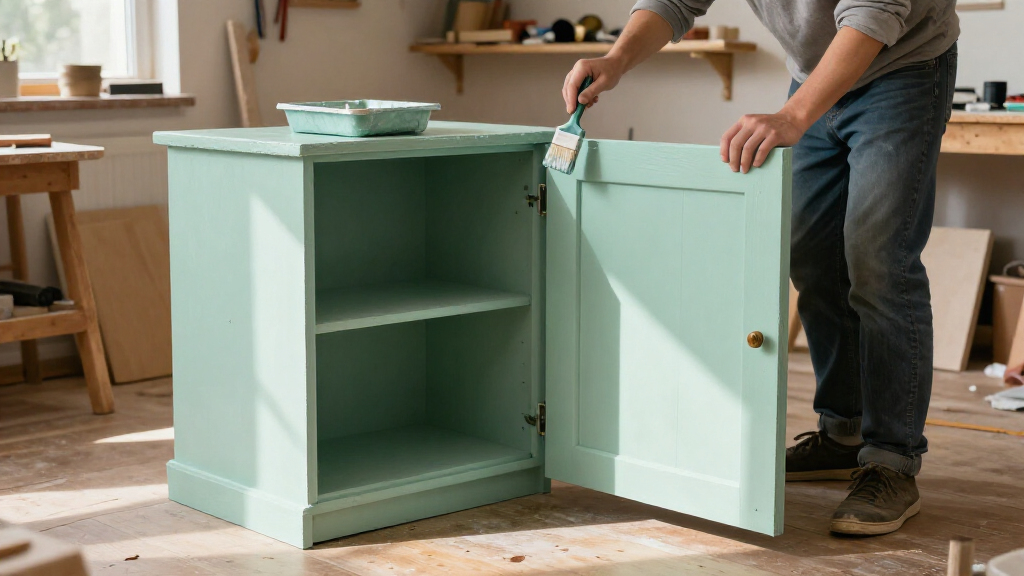
The forecast gives readers a practical signal about the colors design editors and practitioners expect to see in the coming season, while the designers’ examples show that mint need not dominate a room. Used on a lamp, chair, ceiling or another limited surface, it can add contrast without requiring a full room makeover. That makes the trend relevant to renters and homeowners who want to experiment with color on a smaller scale.
The advice also qualifies the report’s upbeat language: mint’s effect depends on its surroundings. Pairing it with warm earth tones, burgundy, pink or terracotta can soften its synthetic quality and connect it to existing materials. These are designers’ recommendations, not guarantees that a particular palette will suit every room or remain fashionable.
Products Worth Considering

Bose TV Speaker (2nd Gen) Compact Soundbar with Bluetooth and HDMI-ARC, Black
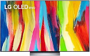
LG C2 Series 65-Inch OLED evo 4K Smart TV (OLED65C2PUA, 2022)

Philips Hue Bridge Pro Smart Lighting Hub
As an affiliate, we earn on qualifying purchases.
From Runways to Living Rooms
The report places mint within a broader cycle in which the favored shade of green changes over time. It describes olive and sage as current reference points and presents mint as the next candidate for SS27. Its supporting examples span fashion collections and the Milan design fair, rather than a measured survey of consumer purchases or completed home projects.
Designers cited by Livingetc connect the color to several visual histories: mid-century space-age palettes, Art Deco interiors and the 1930s-to-1950s. In practice, the shade can appear as a small color accent or a larger architectural element, such as a ceiling. Those references help explain why the same pastel may feel both nostalgic and contemporary.
““Its light-filled pastel teeters on the brink of a bright, almost neon, which makes it feel weightless, synthetic, and unearthly.””
— Amy Moorea Wong, color expert, quoted by Livingetc
Forecast, Not Adoption Data
The supplied report does not give sales figures, a survey of designers, or other data showing how many households are choosing mint. Its claim is a seasonal trend forecast supported by observations, runway examples and interviews. It is not yet clear how broadly the color will appear in residential projects during 2027, or whether it will persist beyond the SS27 season.
The report also does not set a standard for what counts as mint, a shade that can vary from pale green to a brighter, bluer pastel. Nor does it establish that the color suits every room or lighting condition. The examples and recommendations reflect the views of the contributors quoted by Livingetc.
Whether SS27 Brings Wider Use
The next evidence will come from interiors and product collections released for the spring/summer 2027 season, as well as from designers’ projects and retailers’ offerings. The supplied material does not name a specific upcoming launch or give a date for further reporting. For now, readers can treat mint as a forecasted option: test it in a small accent first, and consider the room’s existing colors and light before using it on larger surfaces.
Key Questions
What is the interior color trend identified for SS27?
Mint green is the shade Livingetc’s Style Pulse report identifies as an emerging interior trend for spring/summer 2027.
Does the report show that mint green is already widespread in homes?
No. The material presents a trend forecast based on designer comments, event observations and fashion examples. It provides no adoption survey or residential sales data.
How do the designers suggest using mint green?
Several contributors recommend using it as a controlled accent, such as on a chair, lamp or ceiling, and balancing it with deeper muted colors or earth tones.
What colors does the report suggest pairing with mint?
Examples and recommendations include burgundy, turquoise, rust, rosy pink, cherry and terracotta. The report presents these as design ideas, not fixed rules.
Why does the report describe mint as both modern and nostalgic?
Contributors connect it to space-age and digital imagery, as well as Art Deco and 1930s-to-1950s interiors. The report suggests those associations can coexist in how the shade reads in a room.
Source: livingetc.com